Clusters are easy, meaning is hard
August 2026 · 5 min · Code on GitHub
K-Means never fails. Hand it any dataset and any k and it returns k clusters with a perfectly straight face, including on pure noise. That reliability is the whole danger, and it means a clustering project is only as good as the evidence you gather around the algorithm rather than from it.
Short notes from segmenting telecom customers on the Kaggle churn dataset.
Scaling is not preprocessing, it's the model. K-Means assigns points by distance, and distance only means something when the axes are comparable. Tenure in months, charges in dollars, and a pile of encoded categoricals are not comparable. Skip the scaling and whichever column carries the biggest raw numbers silently decides every cluster boundary. On a distance-based method this step is doing more work than the algorithm is.
Pick k with a measurement, not a vibe. The usual move is to squint at an elbow plot and choose the k that matches the story you already wanted. Silhouette scoring is the more honest instrument: for each point it weighs cohesion against separation, so sweeping k and reading where the average peaks converts "how many segments are there" from taste into evidence.
Worth reporting what that sweep actually returned, because it is a lesson in its own right. Across k from 2 to 10 the silhouette score climbed almost monotonically and topped out at the boundary: 0.44 at k=2, 0.46 at k=6, 0.50 at k=10. The measurement picked ten, but it picked ten by running out of room, not by finding a peak, and a maximum that sits on the edge of your search range is a statement about the range rather than about the data. The honest read is that this feature space has no natural number of segments, silhouette will keep rewarding finer subdivision, so ten is a defensible operating choice rather than a discovered truth. Which puts the weight back on whether the segments mean anything, and that is the next section.
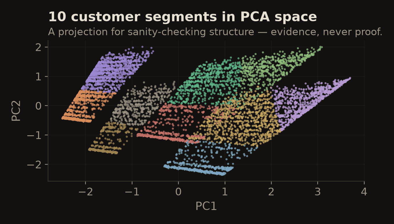
A centroid is not a customer. This is where the project actually earns its keep. Each cluster gets profiled against things the business already recognizes: contract type, tenure, service mix, monthly charges, and the churn rate inside the cluster. "Cluster 2" is a coordinate. A group with a recognizable profile and its own churn rate is the start of a retention conversation, because it says who is leaving and hints at why. That profiling is also the real validation here: churn runs from 4% in the calmest segment to 59% in the worst, a fifteenfold spread that the clustering never saw, since churn was not among the features it was fit on. Segments that separate sharply on a variable held out of the model are segments that correspond to something, whatever the silhouette curve did or didn't say.
Ship something people can poke. Static cluster plots die in slide decks, answering only the one question you anticipated. The Streamlit dashboard filters by cluster, contract type, and churn status, shows per-segment summaries, and exports any slice, which means it answers the questions stakeholders actually ask, and those are never the ones you anticipated.
The algorithm took an afternoon. Everything above is why the result is usable.
Code and dashboard: github.com/ChrisJ1751/Telco_Clustering. Dataset: Kaggle Telco Customer Churn.